


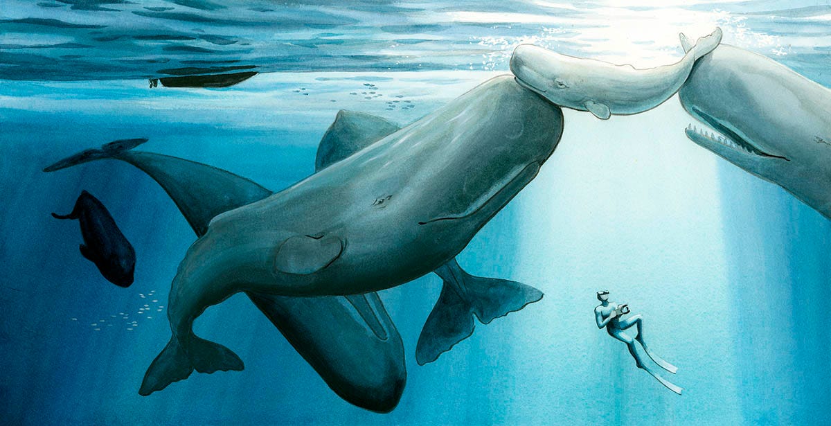
The last book I illustrated, IN THE WORLD OF WHALES, written by Michelle Cusolito, came out almost a year ago. I just recently found out it was nominated as one of the ten Star of the North Nominees for the Minnesota Youth Reading Award. Huzzah! I’m happy it will be making its way into the hands of more young readers.
Anyway, this happy news got me thinking about that book and remembering all of the underwater scenes I needed to create for it. I knew from the start that the book would be a real exercise in painting large, smooth washes.
From my diving research (you can read more about that adventure here) I knew that I didn’t want the water to appear as one solid color of blue, either. The ocean has so much more depth and dimension to it. I needed to paint smooth washes with subtle gradations: light filtering down from above, variations in hue and tone.
The concept of a large, even watercolor wash seems simple enough, but if you’ve ever tried to paint one you may have discovered that it can be devilishly difficult. So I thought I’d break down my approach here in the hopes that it will help. If you’ve struggled with smooth washes before (or are simply curious to learn about how I make them), this post is for you!
The Common Mistake
Most of us set out out on one side of the paper with a wet brush and good intentions, and that’s about as far as the plan goes. By the time we reach the other side, our wash is already turning into a patchy mess. Lines and shapes appear where they shouldn’t, and strange “UFOs” form as pigment blooms back into itself. Where did we go wrong?
The problem is that our wash began to dry before we finished, and it dried unevenly. If the paint isn’t applied strategically, the surface becomes unevenly wet. Some areas soak in, others pool, and as everything dries at different rates, edges start to form—like water evaporating off a driveway after a rainstorm. What to do?
Basic Principles
For smooth washes, three conditions have to be met:
1) Enough water
2) Enough pigment
3) Enough movement and flow
To achieve these three conditions, time is critical. We need to work quickly and let the watercolor flow as evenly as possible.
But how do we do that and stay in control—so the wash has the right color, the right value, and those subtle gradations you’re after?
In the rest of this post, I’ll show you a simple seven-step process you can use in your own work for creating smooth, controlled washes.
Making Your Smooth Wash
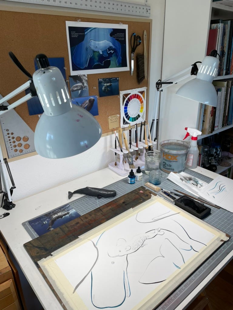
Step 1: Choose your materials.
Paper: This is the material that will make the biggest difference in the quality of your smooth wash. Choose high-quality watercolor paper that can hold a lot of water. Any surface (hot press, cold press, or rough) is fine.
I typically use Arches hot press 300lb, but there are many other good quality brands that artists love and swear by, like Fabriano and Saunders Waterford. Be sure to paint on the correct side of the paper.Work Surface: Attach your paper to a board you can lift and move. It’s easy to assume that your work has to stay flat on the desk. It doesn’t! You can rotate it in any direction. By attaching the paper to a board you give yourself another tool—gravity—to help your wash quickly blend more evenly.
If you’re using 300lb paper you can get away with just taping it down. (I use masking tape and a sheet of Masonite.) With 140 lb paper, you’ll need to stretch it to avoid warping and pooling. For that, use a sturdier board like smooth plywood.Brushes: You’re going to be laying down a lot of paint quickly, so choose a large, soft brush. This is not the moment for your tiny little #00, or even your trusty #10. Large, soft mop brushes are ideal for smooth, even coverage. Large flat brushes also work, but they can leave subtle streaks, especially if they are synthetic. This can be a nice effect sometimes if that’s what you’re going for (like, for example, streaks of light filtering down through water) but beware if you want to avoid it.
Step 2. Decide on your strategy.
Before you begin, take a moment to plan. Think about what you’re painting. Is it a sky? Water? A plain background? Decide where you will start, and where you will end. Is there a gradient? Do you need to mask anything?
When I was newer to watercolor illustration, I made small test paintings and wrote down the order of my washes. Now I usually just think it through for a few minutes. Either way, it pays to have a plan.
If you’re painting a gradient, begin in the lightest part and work toward the darker area, adding pigment as you go. You may need to rotate the paper upside-down or even sideways to make this work.
Step 3. Mask as needed
Mask anything that would be slow to paint around. This is important: you won’t have time to navigate small details because your big wet wash will begin to dry. Remember, you are preparing to paint as quickly as possible.
Frisket works well for small to medium sized details, and frisket paper can help cover larger areas.
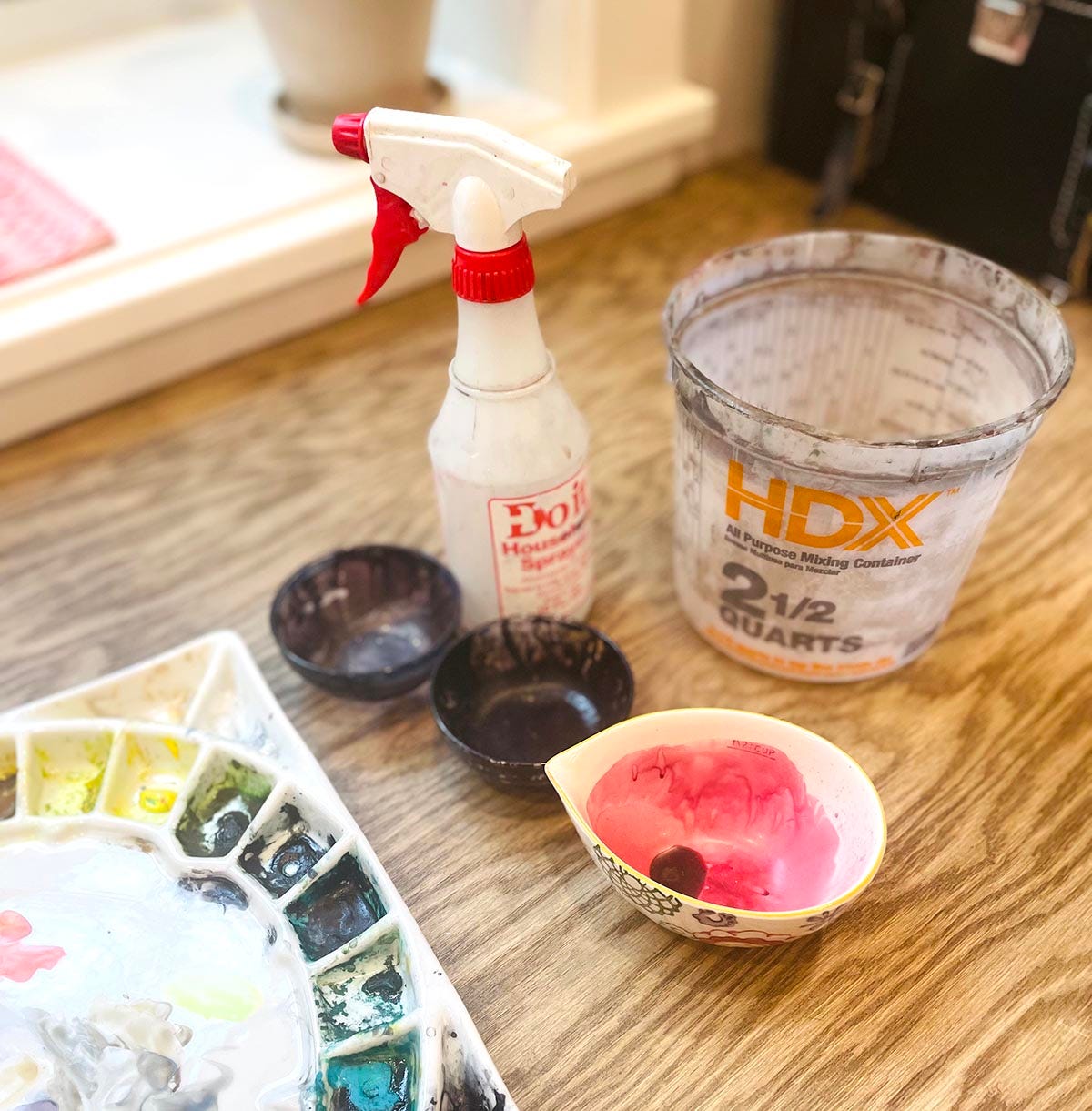
Step 4. Mix your paint.
You’ll need more paint than you think. A lot more! I often mix several tablespoons or even a quarter cup depending on the size. This might seem excessive, but you don’t want to run out halfway through. If you’re painting a color gradient you may need to prepare more than one color.
If your palette is too small, you can use separate dishes. Just be mindful that you aren’t putting toxic paints in anything you eat or drink out of.
Test your colors ahead of time on a small scrap. You might need to use more pigment than you expect when mixing a large quantity of paint like this. It is not unusual for me to go through several tubes of blue working on a book like IN THE WORLD OF WHALES.
Step 5. Take breath… and go!
It’s time to start your wash! Be bold and move with confidence.
As you move down the paper, a “bead” of paint will form at the edge of the wet area. That’s what you want. Keep it moving.
If you want to go even faster, you can also pour the paint onto the paper or use a spray bottle to add water. Once the area is covered you can tilt and rotate the board to help everything blend evenly.
Note: If you run out of paint mid-wash, immediately flood the remaining area with clean water and blend it out. Let it dry completely, then start again.
Step 6. Remove excess.
If everything went well, you’ll have extra paint pooling at the final edge. Gently blot it with a clean, damp brush or a rag to prevent it from flowing back into your wash. (And maybe protect your floor, too. I still have blue in my tile grout from illustrating JUST RIGHT.)
After that? Stop. Let the wash dry.
Step 7. Repeat as needed.
You have your first wet wash down! Nice! But one wash is often just the beginning. If you need more complexity—additional gradients, shifts in color, or layered effects—don’t try to do it all at once. That’s a recipe for a mess. Instead, build it in layers. In watercolor this technique is called glazing.
It can feel risky to paint on top of the wash you just made with such care, but remember: with watercolor, bold and quick beats timid and slow. As long as each layer is fully dry and you follow the same process you can build up rich, complex washes over time.
Final Thoughts
In a future post, I’ll walk through one of my finished illustrations step by step so you can see how these washes actually build in practice.
In the end, watercolor isn’t as complicated as it seems. It can be hard to get used to and even harder to control, but it always goes a bit better when I let go a bit and allow the water to behave like water. I hope this post helps you approach your next wash with a little more confidence, or at least a few new ideas to try!
I’d love to hear how your washes go, or what you tend to get stuck on.
Thanks for reading,
Jessica
This is great and helpful. I have all the supplies. Just need to start paining again. Thanks!